From technical truth to a leadership decision
Using “CRM rollout at Mercury Trade”: the critical path hit an acceptance milestone — here's how to turn that into an argument for the owner.
Step screenshots show the detailed (expert) view. The live demo opens in the lightweight focus mode: the full toolset is one tap away — “expert” on the bottom dock or the F key.
The goal graph and the critical path
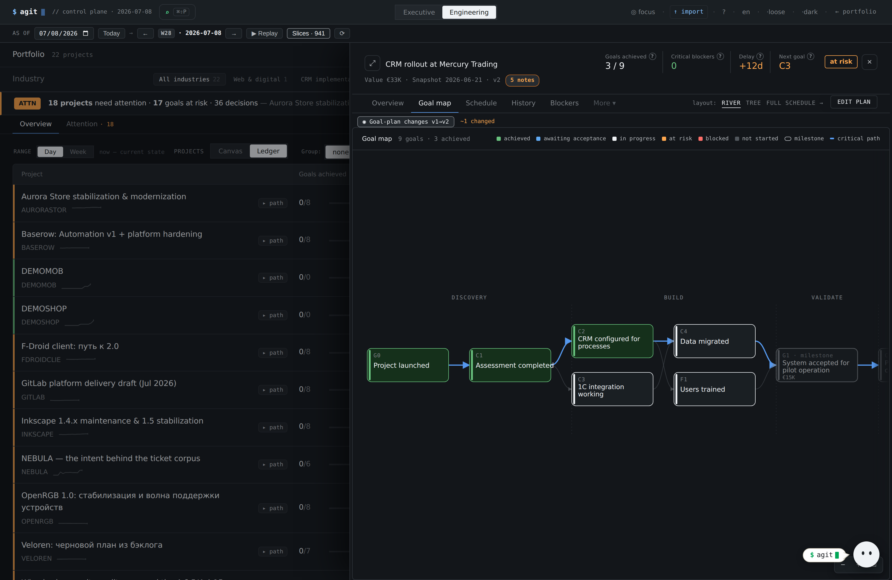
Goals by phase with dependencies; the critical path and blocked/at-risk nodes highlighted. Zoom and pan for big graphs.
You immediately see which node holds the finish and what cascades behind it. That's the basis for “here's the bottleneck”, not “things are a bit late”.
An atomic diff between snapshots
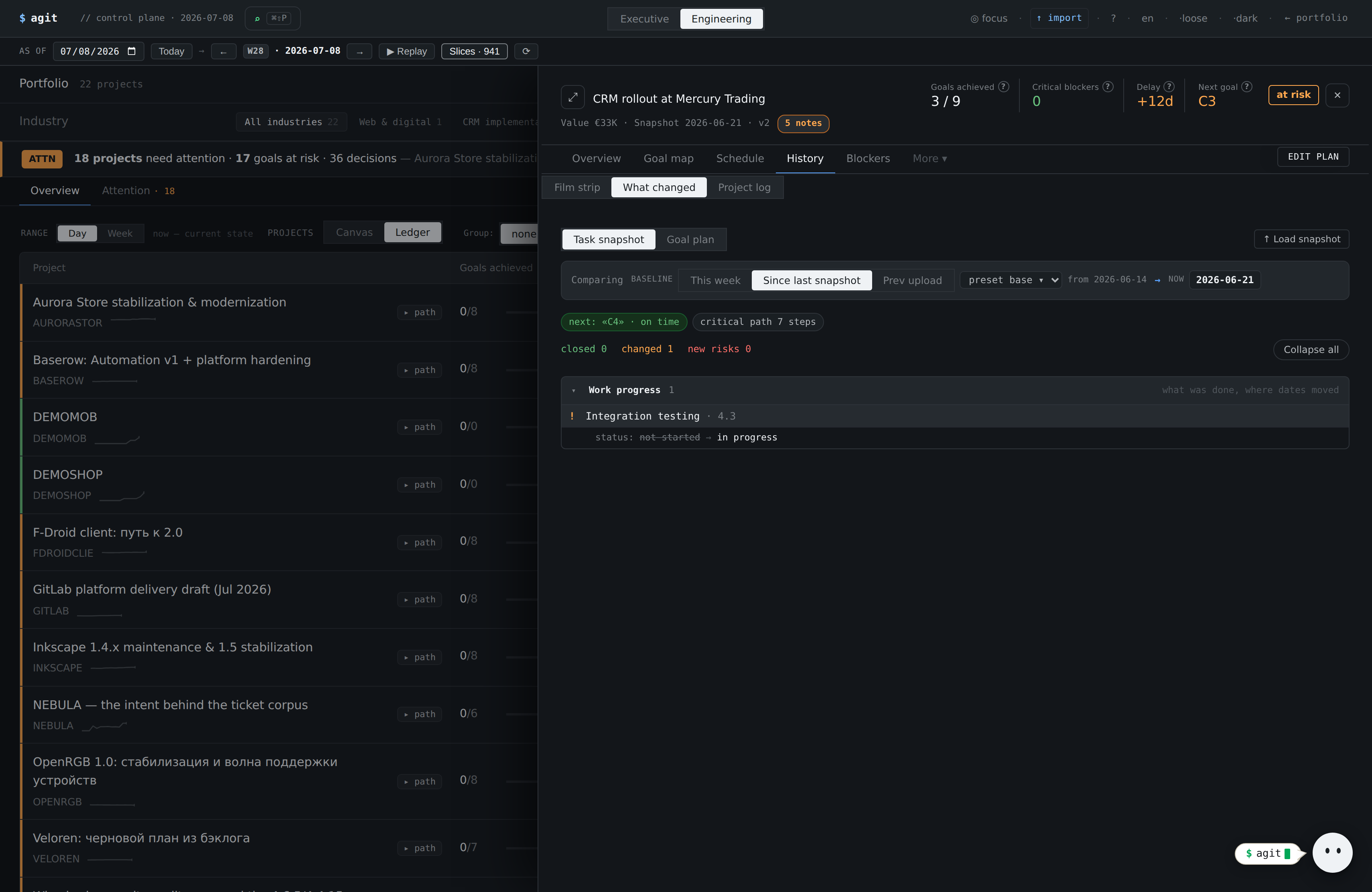
A diff of two snapshots: achieved / slipped / new risks, and per task the exact field change (deadline: May 15 → May 30). Plus a signal lane (what happened between snapshots).
Exact dated facts instead of feelings — ready material to justify a deadline or scope change.
Plan health: where it's broken
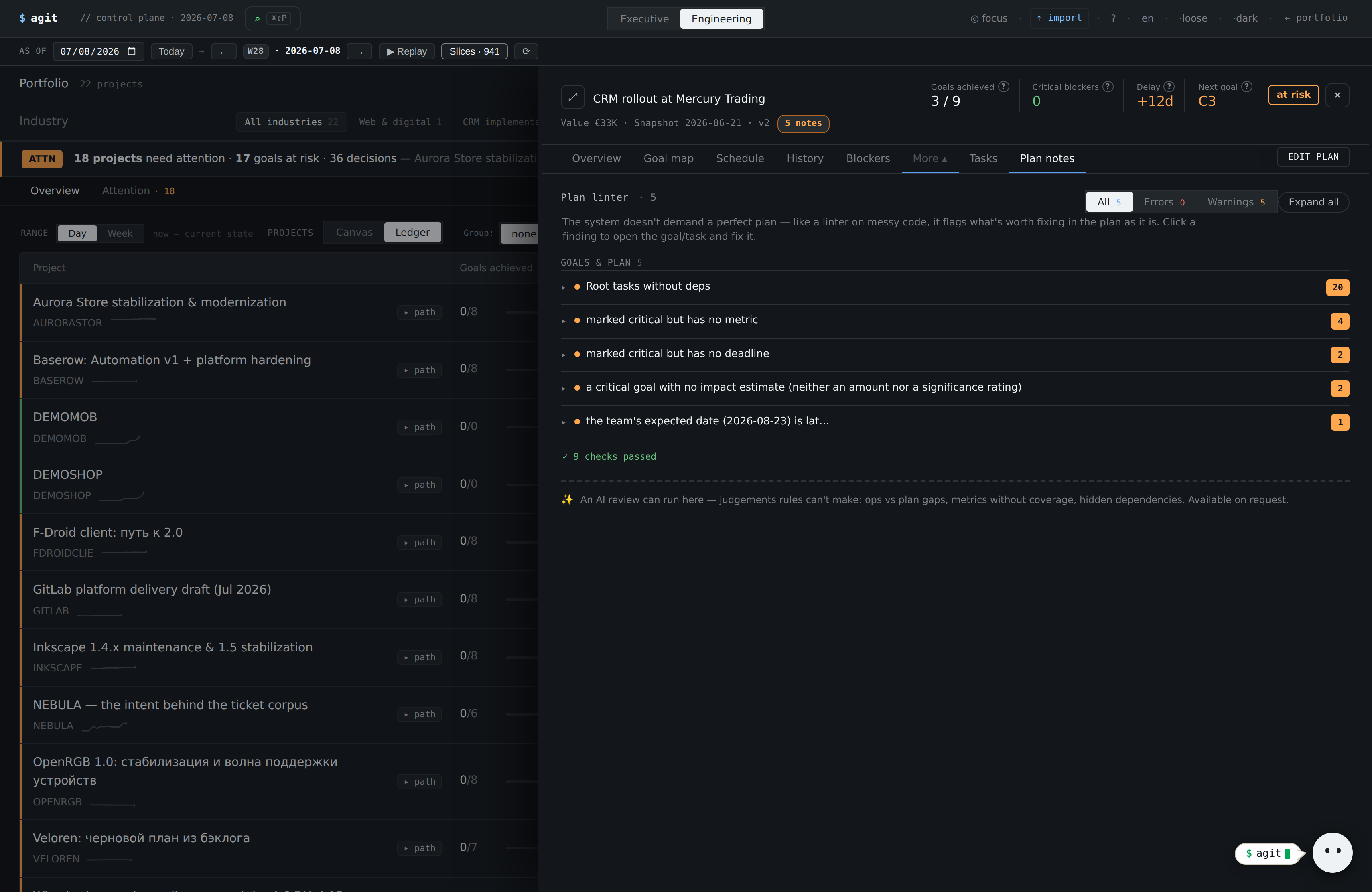
Left — observations and plan structure (tasks with no deadline, no links). Right — specific anomalies and tasks in focus. Every item drills to a specific task.
You see not just “what's wrong” but which tasks exactly — you can open the task card and point.
Rewind two weeks — and show the drift
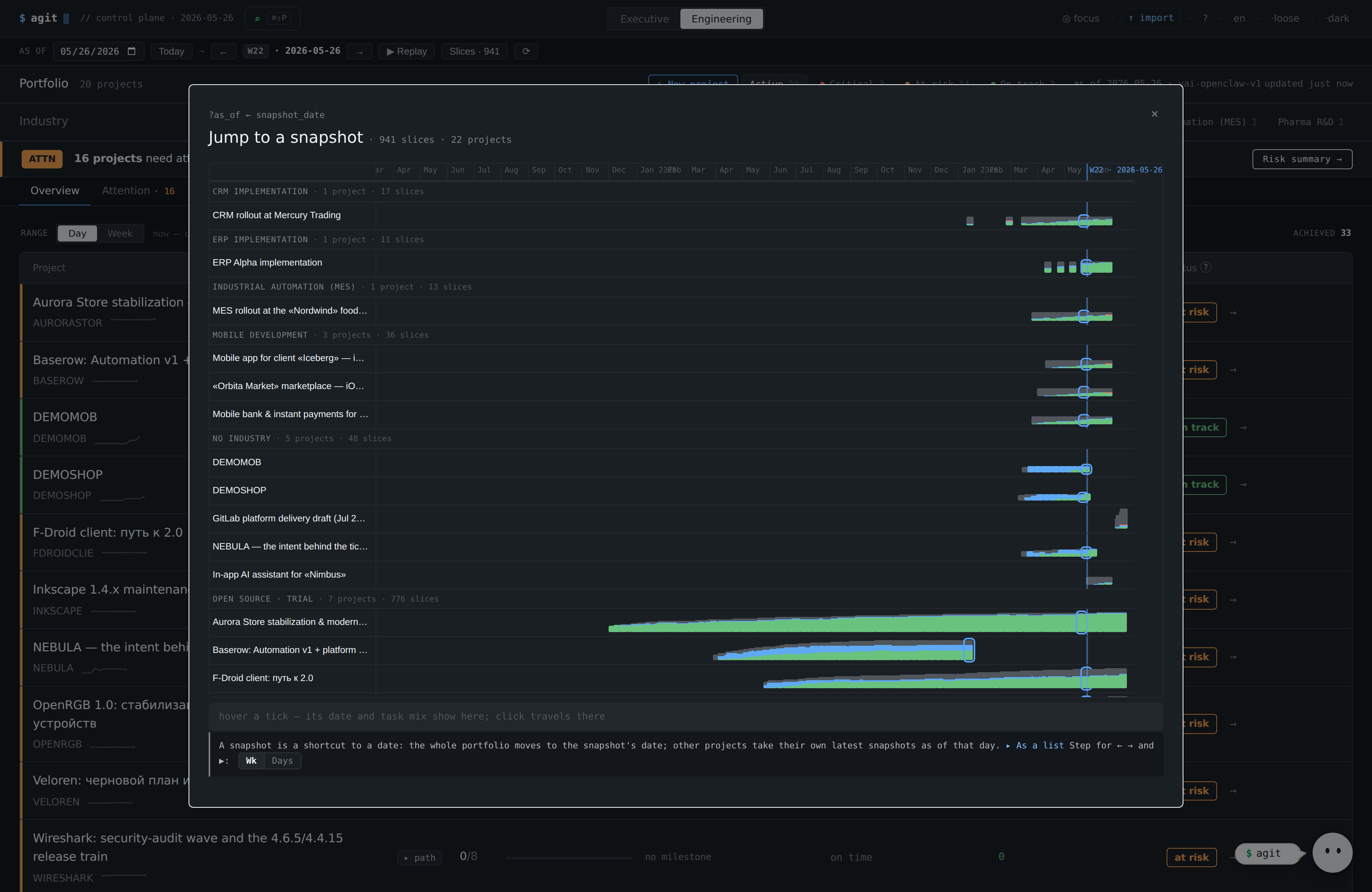
“2 weeks ago → now”: the state on the chosen date is rebuilt from snapshots. You see how it was then and how it diverged from plan by today.
Proof of drift over time — can't be written off as “intended”. A strong argument at retro and upstairs.
Working state and backlog
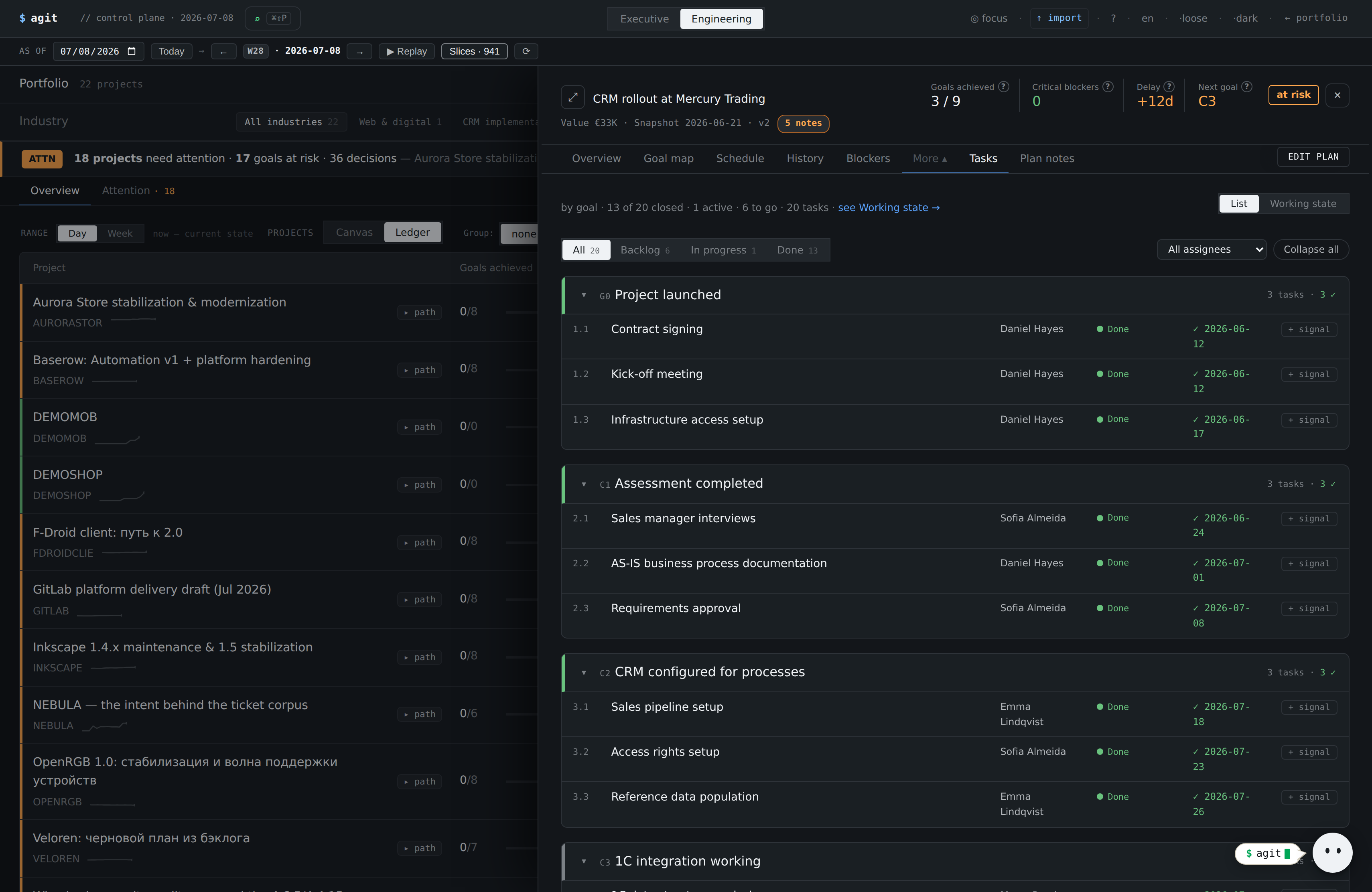
Columns Shipped / In progress / Stuck and a collapsible Backlog — grouped by goal with a “+N more” counter. All computed from the snapshot, not hand-maintained.
An honest operational picture of the team; you see what's stuck and how much sits in the backlog — without a separate board.
Event log + console (REPL)
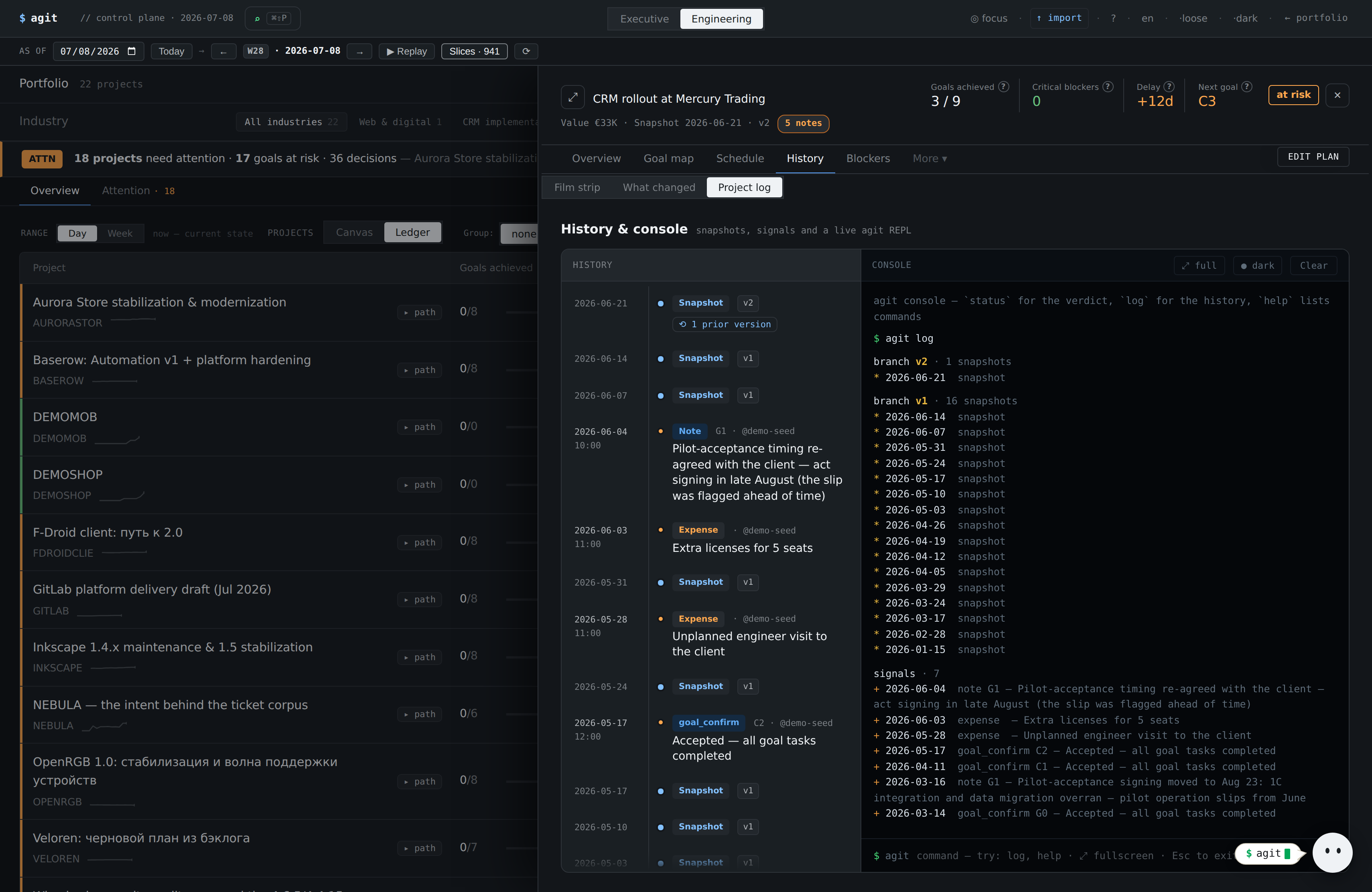
History on the left — snapshots and acceptances with dates. On the right, the agit console: the log command prints a clickable history; you can jump to any snapshot (checkout) or record an acceptance.
An append-only log: entries aren't edited — changes are added as a new event. An engineer's tool that doubles as the evidence base.
Translation into money for the owner
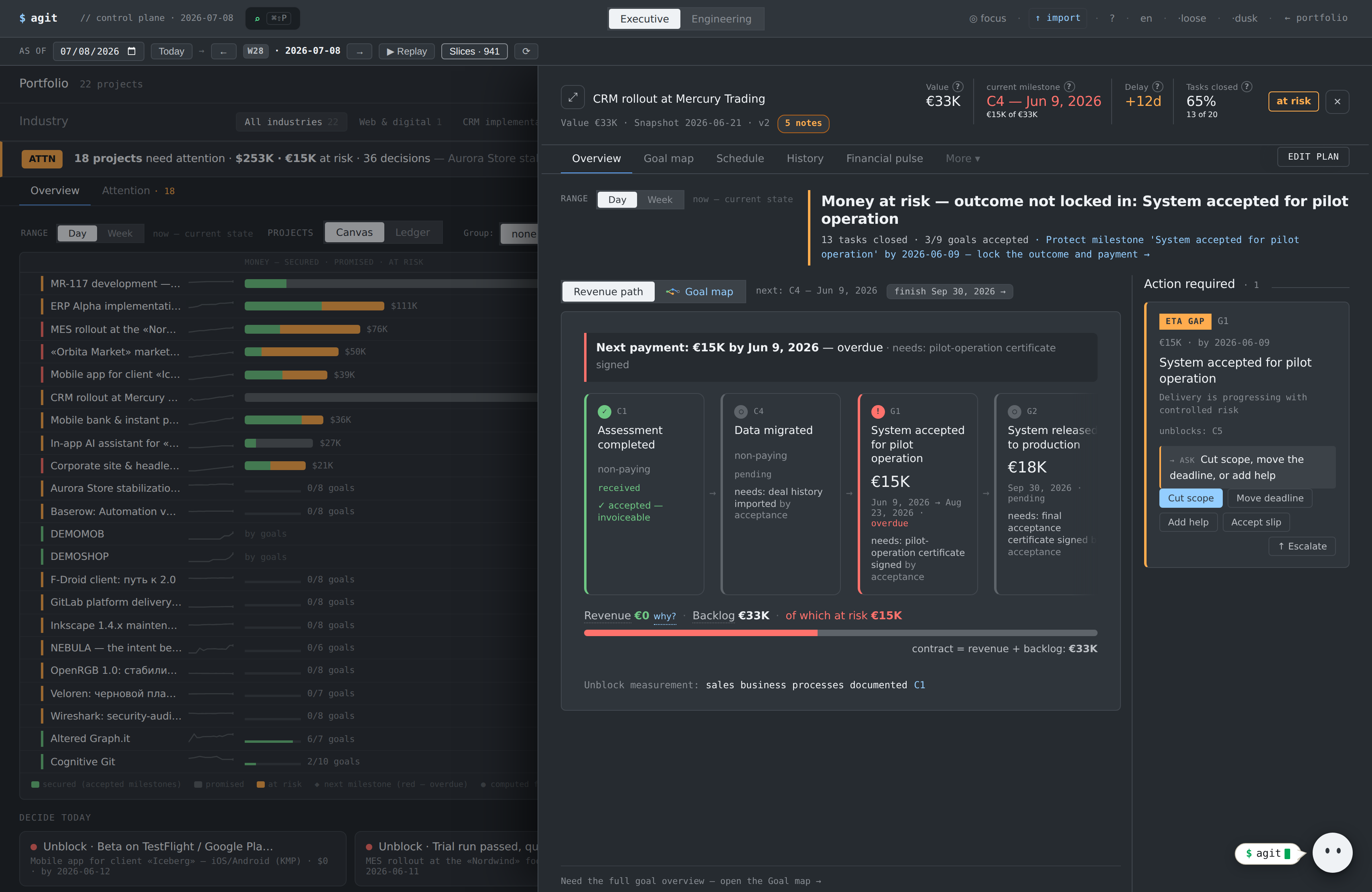
The same project in money terms: the “money at risk” verdict, the revenue path, the Revenue / Backlog / At-risk split. The Manager / Engineer perspective toggle lives in the global header.
A ready screen to bring to the owner: the technical truth translated into money and one decision. You're the champion — and you have what it takes to convince.
First technical snapshot in ~10 minutes
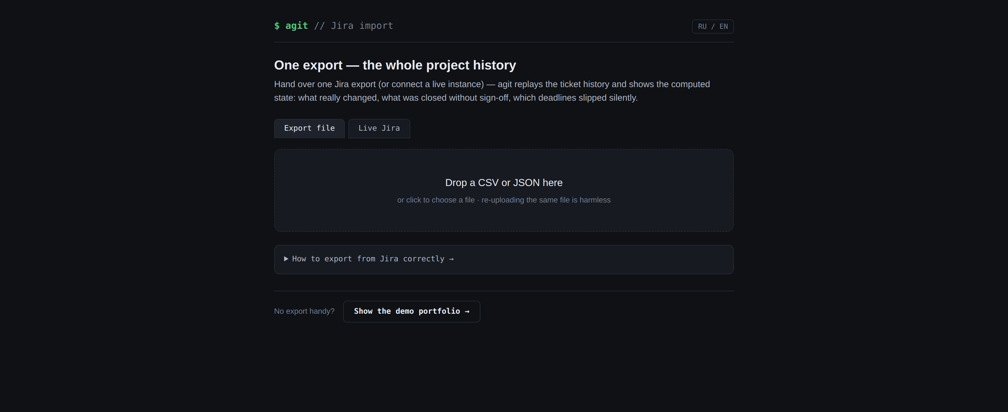
Import a task snapshot from Jira / Excel (CSV or XLSX) — state builds at once; add the goal graph later. There's a tasks-only mode to start.
You can stand it up on your project in an evening and bring leadership not an idea but a working picture on real data.